Saturday, April 30, 2016

Greenland


I love icebergs. Maybe it’s because I grew up in the Sunshine State; who knows? When I was younger, I was surprised to learn that icebergs are a luminous turquoise, not white. I’d always associated turquoise with the Caribbean and sandy beaches, not frigid navy blue water where you could not see the bottom. 

Blue is my favorite color and any shade that evinces thoughts of water is the most prized. So color is part of my fascination. As is the water - my theme for this cycle. And of course, the hidden part: the part beneath the water that has become a metaphor in all walks of life including business management, branding, risk assessment and human potential. The symbolism speaks to me too.

So this Florida girl likes icebergs despite having only seen one in her life. I saw it while returning from a family vacation in Iceland. Odd, I’d have thought I’d seen one in Iceland, not flying over Greenland. But I was told the Vikings intentionally named their lush home Iceland so no one would come, and they gave Greenland its name to entice visitors there instead. When travelers discovered desolate, frozen Greenland, they would surely never venture to its neighbor Iceland. Or so the legend goes. 

So I saw the green rolling hills and rocky cliffs of Iceland without glimpsing a single iceberg. It wasn’t until the flight home over Greenland I saw my first (and only). It’s on my bucket list to see more. One day I will visit Alaska and photo them until my heart is content. Until then, I have my imagination and my art.

“Greenland” is a wholecloth quilt painted with Setacolor soft body acrylic and Jacquard fabric paints and enhanced with Shiva sticks and Derwent inktense pencils. It is quilted with cotton and polyester threads.

Due to some unexplained brain malfunction, my piece measures one inch longer than it should. Of course I didn’t discover my error until today. So…Greenland measures 41” H X 30.5 W.

Thursday, April 28, 2016

Silence : Gray


I read Kate's challenge, I thought of "Dansaekwha".
Dansaekwha is meditative and holistic.
Dansaek­hwa reveals an intensity of thought and labor as well as the depth of silence.
The process of my work is the same 
I enjoy the process, cutting, piecing, and sewing, and...
Repeat and repeat and….
Seeing the changes that occur, seeing the creation of something new is amazing.
It is like meditation for me.


The size : 40” high by 18” wide. 

Wednesday, April 27, 2016

Tattooed Dog, Otherwise Known as Albert


For this design, I used a combination of black and white patterned fabrics, as well as a hand-dyed batik for the background and parts of the eyes.  I tried to utilize the black and white prints in a way that came across as light, medium and dark values. 

When I originally proposed this challenge, I had intended to use purple as my one color.  But then I saw Albert's black and white coat and warm brown eyes and my whole idea changed.

I don't like to post an "unfinished" work on the V9 blog, but I think there is more to do on this one. I'm really enjoying the way the patterns are playing together.


Finished size 24"W x 40"H

Indigo Abstract

I have to profusely thank Kate for this challenge!  I was so wrapt in the idea that I felt swallowed whole.

For decades I have collected yukata, a Japanese un-lined garment generally worn in the summer or after bath....and mostly the more traditional indigo-dyed.  I have also collected much smaller pieces of vintage yukata.  Now was my chance to actually use many of them in one piece.  Admittedly it did take time to go through the lot of them to decide whether I would choose the blue with white designs or the white with blue designs.

In the end I chose blue with white indigo dyed cottons, largely kasuri  Only on piece has its design printed on it.

I also decided to continue my 'kimono abstract' series.

This challenge and my stash naturally resulted in using the 'boro' style.  For generations, beginning with frugal farmers, indigo especially has been re-sewn in patches to prolong the life of a garment.  Referred to as 'boro', it is of the forgotten idea "too good to waste".

That is an idea that finds residence in my studio!

Indigo Abstract 40"x21"
Vintage indigo cottons, hand stitched


Indigo Abstract
Japanese Boro


Indigo Abstract detail

Okinawa Sand

Inspired by this photo that a friend sent to me about the star sands of Okinawa (see previous post), I decided to use this idea- which is in keeping with the commitment to macro imagery in this cycle- for a monochromatic piece using shades of brown.
Of course I began with drawing, trying to get a variety of the plump little shapes.
They are colored solid black with my sharpie so that I can make them into a vector pattern for my electric cutter.
 Here's a batch fresh out of the cutter with some peeled off shapes at the top of the mat- I'm using non woven material here to avoid fraying edges....also because I can burn holes in them with my hot knife- they are all done individually because I wanted them all to be different, like the individual little organisms they once were.
 Then they're dampened a bit, and painted - the pigment is naturally drawn to the outside edges since they dry first....
 creating a nice, three dimensional color variation.
 Of course I had to use some of my beloved dorozome mud silk from Okinawa as the base layer-
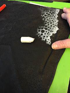
 paintsticked a bit of wave foam on it first, then quilted the whole thing-

 then up on the design wall, with the individual star shapes positioned, as naturally as I can make it, overlapping each other randomly,
 They're all sewn on with monofilament and an appliqué stitch- there's no quilting on them at all.
 Et voila- Okinawa Sand, 40x18"


Math Teacher

by Lin Hsin-Chen


When I was young, my grandmother used to teach me to count Hydrangea flowers, not only the numbers of balls, but also the inflorescence. Every little flower has its own posture. Since then, I learned to observe layers. It made a huge impact on me. Hydrangea flower is my math teacher.

I feel intimate with flowers. It is probably because I am grateful to them and we are in a mentorship relationship. Life is like a ball. The circular curve, from the core to the exterior, is controlling the way we think. Thinking changes and transforms through interaction with others. Just like mathematics, although ever-changing, the answer could be found eventually.

Talking with nature allows us to clear up complicated and dirty concepts and renew our perceptions. I did a math exercise when creating this quilt: “add” observation to convert the texture of flowers into visual index; “subtract” extra details to emphasize the inflorescence; “multiply” the sincerity and courage to take the challenge; “divide” the needle pitch that I was preoccupied. Thank you, Kate, for the challenge.

Materials: commercial cottons, dyed fabrics, gauze, beads, Romanian thread, wool yarn
Techniques: hand stitched, hand pieced, hand appliquéd, hand quilted

Size: 100 x 100 (cm)

Nocturne in Green

Nocturne in Green ©2016, 40" x 21"
Thank you, Kate, for inspiring me to try something new and experimental. A lot of good information came out of this process and I know I will be referring to it in something in the future.

my inspiration


Having done a lot of monochromatic studies in grayscale, I thought I'd tackle my photographs of the campus greenhouses. I've thought about them for a long time, and thought I'd worked out a plan....but I hadn't.


I started by painting 3 layers of silk organza (and a layer of Damask linen) with shades of gray-green Dye-na-flow. Then, carefully selected weeds foliage from my drought recovered forest yard were laid out on the fabric to sun print.


The sun printed negatives from the foliage were pale negatives of the outline, so I traced the outlines and created several different stencils from the different layers.


Using Dye-na-flow in a spray bottle, I spritz the stencil with black dye.


I repeated it with the other layers using the different stencils.


Then layer by layer, the silk was added to the linen background and batting, topstitching the black stencil with black thread. Finally I added the top layer of silk organza and stitched the remaining details from the original sun printing in with a Size 20 variegated thread.
Nocturne in Green, detail ©2016, 40" x 22"

The joy in green


The Joy of being Green
25 1/2" w x 39 1/2" [64cm w x 100.5cm]
I didn't fully appreciate this colour until I decided to work with it in this monochromatic challenge. My garden was the inspiration and I discovered all shades of green there, from limey light green, blue green through to grey green.
I hope the energy of living plants is conveyed in The Joy of being Green.

Materials: cotton, commercial fabrics, dye, oil paint sticks, fusible web, batting, threads
Techniques: hand dyed, rubbed, raw edge applique, machine pieced, machine quilted
   

Fields at Dusk


I found the monochromatic challenge very appealing, so I set out to make a piece almost straight away.  A map seemed to be the obvious choice – a variety of shades of one colour for the fields, black and white for the buildings, grey for the roads and paths.

My first thought was using green – the obvious colour for fields.  However I thought it may be too ‘strong’ without other, warmer colours to counteract it – too stark with just black and white.  So I opted for purple – the colour of dusk.


Purple is a mixture of mainly red and blue, so its shades can veer towards the blue or the red. If a lot of red is added, it becomes too pink.  So I opted to combine both purples - those veering towards red, and some veering towards blue.  I had a variety of hand-dyed fabrics fitting the bill so that wasn’t a problem.


The quilt is improvisationally pieced, freehand, using no rulers. The dusk fields are densely machine quilted, with a range of purple threads, and have added stitched ‘paths’ using a double needle and two different grey threads.  There is some minimal quilting in the white areas, and none in the black areas; and none either on the grey roads.


How does it relate to my Magic and Science theme?  Well – these kinds of views from above weren’t easily available before cameras, aeroplanes, and satellites – so there is the science connection.

The size is 40” high by 22” wide.  I am very happy with it.

Saturday, April 23, 2016

Challenge 7: Pick a Color, Any Color

Artists, website designers, interior decorators and fashionistas often use monochromatic color schemes. When done successfully, simplifying the color palette can unify a composition and increase the image's visual impact. Reducing the color scheme to a single hue often intensifies the emotional impact of that color.


Our challenge: Spin the color wheel and pick one hue to create a monochromatic design. You may use various tones, tints and shades of that hue, as well as black, white and gray in any proportion you like.


The finished piece must measure 40" from top to bottom, but can be any width. Have fun!

Wednesday, April 20, 2016

One Color, Two Attempts


Monochromatic pieces can be so powerful. I have long admired the work of a local artist Derek Gores who specializes in magazine collage and whose pieces are often monochromatic. His works are compelling to me because of their balance of intricacy and simplicity.

"I AM"
Lisa-Marie Sanders © 2011
I took a class from Derek years ago and created the art piece of which I am most proud. Although I was most concerned with translating tiny pieces of magazines into a dimensional image, I also enjoyed the use of a single color. It was my first and, until Kate’s challenge, only monochromatic endeavor.


the inspiration: my mom


To see how attempt number two turns out, check out the V9 reveal next week!