Showing posts with label Challenge 3-7. Show all posts

Saturday, April 23, 2016

Challenge 7: Pick a Color, Any Color

Artists, website designers, interior decorators and fashionistas often use monochromatic color schemes. When done successfully, simplifying the color palette can unify a composition and increase the image's visual impact. Reducing the color scheme to a single hue often intensifies the emotional impact of that color.


Our challenge: Spin the color wheel and pick one hue to create a monochromatic design. You may use various tones, tints and shades of that hue, as well as black, white and gray in any proportion you like.


The finished piece must measure 40" from top to bottom, but can be any width. Have fun!

Wednesday, April 20, 2016

One Color, Two Attempts


Monochromatic pieces can be so powerful. I have long admired the work of a local artist Derek Gores who specializes in magazine collage and whose pieces are often monochromatic. His works are compelling to me because of their balance of intricacy and simplicity.

"I AM"
Lisa-Marie Sanders © 2011
I took a class from Derek years ago and created the art piece of which I am most proud. Although I was most concerned with translating tiny pieces of magazines into a dimensional image, I also enjoyed the use of a single color. It was my first and, until Kate’s challenge, only monochromatic endeavor.


the inspiration: my mom


To see how attempt number two turns out, check out the V9 reveal next week!

Wednesday, April 13, 2016

Green: Houses


For the last couple years, I've had a fascination with the greenhouses on campus. The thrill of a late evening walk - discovering the lights are on. Not sure what it's all about, but I think they're mysterious and fascinating - like a story could unfold there.... Pretty monochromatic, too. Looking forward to seeing what others have created for this challenge. Reveal on April 27!


Thursday, April 7, 2016

star sands

inspired by a photo sent to me by my friend Tammy, I did some research on the fascinating history of
the star sands of Okinawa.
for a full explanation, go to this website-star sands
here are some pics and a quote from the website to pique your interest-

Star sands, the minute wonders of nature found on beaches and in the sands of Indo-Pacific waters are protozoa that belong to the Foraminifera family. What made these earthly stars and how did they appear, though? Herein lies a wonderful story that spars with modern biology.


Wednesday, April 6, 2016

Think like a Tree

by Lin Hsin-Chen


Thank you Kate for the challenge topic! When I received the topic, I had a “bing-bing” moment--my first instinct was “green”. A tree-like thinking of color comes to mind. Although I am not sure if this inspiration will be connected with my work, I am truly excited about the challenge.

My husband is an architect. Recently, we have been discussing the issue of “Green Infrastructure”. As global citizens, what can we do to protect the environment and preserve the green resources?

I would like to realize my ideal “Green Infrastructure” via my work! Whether I am going to create my work based on my initial idea or not, I am thankful for the happiness that this inspiration brings me.

Wednesday, March 23, 2016

단색화 (Dansaekwha: Korean Monochrome Painting)

When I read Kate's challenge, I thought of "Dansaekwha" which is my favorite art.

"Dansaekhwa" is a movement that emerged in Korean painting starting in the mid-1970s, when a group of artists began to push paint, soak canvas, drag pencils, rip paper, and otherwise manipulate the materials of painting. Tansaekhwa means monochrome painting in Korean and was used by the critic Lee Yil in 1980 to refer to a group of largely non-figurative paintings painted in neutral hues. Promoted in Seoul, Tokyo, and Paris, Tansaekhwa grew to be the international face of contemporary Korean art and a cornerstone of contemporary Asian art. www.venice-dansaekhwa.com

Painstaking Endeavor in Silence
Interest in monochrome painting emerged in the Korean art community in the early 1970s and then spread like an irrepressible wave in the mid-70s. Although originating under the influence of Minimal Art from the West, it has taken root and flourished as a uniquely Korean art form over the past 40 years.
But what is that makes Dansaekhwa distinctive from Western monochrome art or Minimal Art? Professor Yoon explained that Western monochrome painting and Minimal Art are rational and logical, based on principles of mathematics and language, while Dansaekhwa is meditative and holistic.

In contrast to the empty painting of Minimalism, Dansaek­hwa reveals an intensity of thought and labor as well as the depth of silence. Though limited to a single color, it evokes a vivid feeling of the colors texture through multiple brushstrokes, repeated tens or hundreds of times. As such, the density of black paint, which results from repeated brushstrokes, cannot be achieved by broad, single strokes. "While Western monochrome painting focuses on the visual, Dansaekhwa is of a tactile quality and expresses the Korean philosophy of assimilation with nature, explained Professor Yoon. It is created from an ecological, cosmological, and earthly viewpoint, in contrast to the formalistic perspective of the West.

With their works, Dansaekhwa artists seek to internalize the aesthetics of Korean spirituality, such as blankness, contemplation, movement within stillness, inaction of nature, and moderation, all based on a traditional principle of going with the flow of nature. All the while they have struggled with themselves to master their own manner of expression. As if cultivating the spirit, they express a transcendental state of mind on canvas through their repetitive brushstrokes. Unlike such Minimalists as Robert Morris or Donald Judd, who suggested concepts but had their works made with industrial materials, Dansaekhwa artists sought to express the truth of nature through rigorous physical dedication over decades, like the monks who undergo arduous meditation.

From : Meditation by Brushstroke Dansaekhwa Korean Monochrome Painting

By Koh Mi-seok, Senior Reporter of Art & Design, The Dong-a Ilbo

Tuesday, March 15, 2016

Early Spring: Mostly Monochromatic

I was ready for Kate's challenge after my dyeing experiment from the previous challenge using natural dyes; which, for me was really an exercise in using monochromatic material.

I was SO prepared for Kate's challenge.....that I jumped in the day after her post...and it was finished in no time.  That NEVER happens.  Usually I'm wrestling for some time...some times not very successfully.  

Turns out, that was a very happy coincidence.  I usually get my creative juices going with inspirations from my natural surrounding.

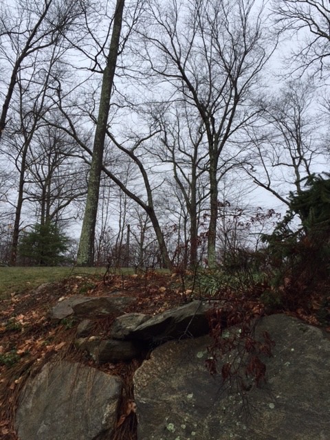
Feb and Mar in New England are REALLY monochromatic!

These pics are viewed from my studio.  Brown, Brown, more Brown, Blue, teeny bit of Green. Hard to get the juices going.


Until you get close.  Yeah!  Color!
I'm really looking forward to viewing our members' responses to this challenge.

Thank you, Kate.  I loved this challenge!

Tuesday, March 8, 2016

Going green

Green is not my favourite colour, but I have been having fun playing with the many variations of this colour. Taking my garden as inspiration I dyed cotton fabric for a first layer and background of my design. My garden is in need for some care and attention, but I never seem to be home long enough.
Along the way I discovered a lot about this colour.
These are the first steps to completion. All will be revealed in April!