Showing posts with label monochromatic. Show all posts

Wednesday, April 27, 2016

Tattooed Dog, Otherwise Known as Albert


For this design, I used a combination of black and white patterned fabrics, as well as a hand-dyed batik for the background and parts of the eyes.  I tried to utilize the black and white prints in a way that came across as light, medium and dark values. 

When I originally proposed this challenge, I had intended to use purple as my one color.  But then I saw Albert's black and white coat and warm brown eyes and my whole idea changed.

I don't like to post an "unfinished" work on the V9 blog, but I think there is more to do on this one. I'm really enjoying the way the patterns are playing together.


Finished size 24"W x 40"H

Indigo Abstract

I have to profusely thank Kate for this challenge!  I was so wrapt in the idea that I felt swallowed whole.

For decades I have collected yukata, a Japanese un-lined garment generally worn in the summer or after bath....and mostly the more traditional indigo-dyed.  I have also collected much smaller pieces of vintage yukata.  Now was my chance to actually use many of them in one piece.  Admittedly it did take time to go through the lot of them to decide whether I would choose the blue with white designs or the white with blue designs.

In the end I chose blue with white indigo dyed cottons, largely kasuri  Only on piece has its design printed on it.

I also decided to continue my 'kimono abstract' series.

This challenge and my stash naturally resulted in using the 'boro' style.  For generations, beginning with frugal farmers, indigo especially has been re-sewn in patches to prolong the life of a garment.  Referred to as 'boro', it is of the forgotten idea "too good to waste".

That is an idea that finds residence in my studio!

Indigo Abstract 40"x21"
Vintage indigo cottons, hand stitched


Indigo Abstract
Japanese Boro


Indigo Abstract detail

The joy in green


The Joy of being Green
25 1/2" w x 39 1/2" [64cm w x 100.5cm]
I didn't fully appreciate this colour until I decided to work with it in this monochromatic challenge. My garden was the inspiration and I discovered all shades of green there, from limey light green, blue green through to grey green.
I hope the energy of living plants is conveyed in The Joy of being Green.

Materials: cotton, commercial fabrics, dye, oil paint sticks, fusible web, batting, threads
Techniques: hand dyed, rubbed, raw edge applique, machine pieced, machine quilted
   

Fields at Dusk


I found the monochromatic challenge very appealing, so I set out to make a piece almost straight away.  A map seemed to be the obvious choice – a variety of shades of one colour for the fields, black and white for the buildings, grey for the roads and paths.

My first thought was using green – the obvious colour for fields.  However I thought it may be too ‘strong’ without other, warmer colours to counteract it – too stark with just black and white.  So I opted for purple – the colour of dusk.


Purple is a mixture of mainly red and blue, so its shades can veer towards the blue or the red. If a lot of red is added, it becomes too pink.  So I opted to combine both purples - those veering towards red, and some veering towards blue.  I had a variety of hand-dyed fabrics fitting the bill so that wasn’t a problem.


The quilt is improvisationally pieced, freehand, using no rulers. The dusk fields are densely machine quilted, with a range of purple threads, and have added stitched ‘paths’ using a double needle and two different grey threads.  There is some minimal quilting in the white areas, and none in the black areas; and none either on the grey roads.


How does it relate to my Magic and Science theme?  Well – these kinds of views from above weren’t easily available before cameras, aeroplanes, and satellites – so there is the science connection.

The size is 40” high by 22” wide.  I am very happy with it.

Saturday, April 23, 2016

Challenge 7: Pick a Color, Any Color

Artists, website designers, interior decorators and fashionistas often use monochromatic color schemes. When done successfully, simplifying the color palette can unify a composition and increase the image's visual impact. Reducing the color scheme to a single hue often intensifies the emotional impact of that color.


Our challenge: Spin the color wheel and pick one hue to create a monochromatic design. You may use various tones, tints and shades of that hue, as well as black, white and gray in any proportion you like.


The finished piece must measure 40" from top to bottom, but can be any width. Have fun!

Tuesday, March 15, 2016

Early Spring: Mostly Monochromatic

I was ready for Kate's challenge after my dyeing experiment from the previous challenge using natural dyes; which, for me was really an exercise in using monochromatic material.

I was SO prepared for Kate's challenge.....that I jumped in the day after her post...and it was finished in no time.  That NEVER happens.  Usually I'm wrestling for some time...some times not very successfully.  

Turns out, that was a very happy coincidence.  I usually get my creative juices going with inspirations from my natural surrounding.

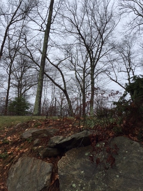
Feb and Mar in New England are REALLY monochromatic!

These pics are viewed from my studio.  Brown, Brown, more Brown, Blue, teeny bit of Green. Hard to get the juices going.


Until you get close.  Yeah!  Color!
I'm really looking forward to viewing our members' responses to this challenge.

Thank you, Kate.  I loved this challenge!

Tuesday, March 8, 2016

Going green

Green is not my favourite colour, but I have been having fun playing with the many variations of this colour. Taking my garden as inspiration I dyed cotton fabric for a first layer and background of my design. My garden is in need for some care and attention, but I never seem to be home long enough.
Along the way I discovered a lot about this colour.
These are the first steps to completion. All will be revealed in April!